Simple Checkout Page Redesign
- Estado: Closed
- Premio: $500
- Propuestas recibidas: 31
- Ganador: danangm

Resumen del concurso
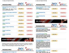
Hello designers for years I have been dealing with a poorly designed checkout page and I think with a redesign to give it a more professional look I could increase sales. The URL of the current page is www.madduxsports.com/purchase.html. My entire site uses a template but I was having problems making the purchase page look good with it enabled so I ended up just removing the left and right hand side navigation on that page to allow for more room.
I am open to either keeping it this way to allow more room side to side OR adding back the right and left hand side navigation if you think your design would look better with it. If you click on the home page of the website you will see my template. I will leave that decision up to you.
I dont need a new header image or top navigation. I plan to keep what is there now.
Everything that you see on the page text, and different packages will need to remain.
Other than that I dont have anything else to add. Let me know any questions you may have.
Habilidades recomendadas
Comentarios del empleador
“came up with a great design!”
![]() madduxsports, United States.
madduxsports, United States.
Tablero de aclaración pública
Cómo comenzar con los concursos
-

Publica tu concurso Fácil y rápido
-

Consigue toneladas de propuestas De todo el mundo
-

Elige la mejor propuesta ¡Descarga fácilmente los archivos!