Graphic Design - Create a Cool Lake Logo
- Estado: Closed
- Premio: $100
- Propuestas recibidas: 184
- Ganador: reynoldsalceda

Resumen del concurso
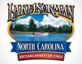
This logo is for a lake area. The design will be screenprinted onto t-shirts, so it needs to have bold colors.
Habilidades recomendadas
Comentarios del empleador
“reynoldsalceda delivered a design that was beyond my expectations, it was better than I had imagined when I started the contest! Great talent. Prompt service. Followed directions perfectly. Communicates very well. Patient through multiple changes/edits. Thank you! I'd definitely work with again.”
![]() dotrain4u, United States.
dotrain4u, United States.
Tablero de aclaración pública
-

reynoldsalceda
- 11 años atrás
Hi, I have sent you a private message. Please check. Thanks.
- 11 años atrás
-

passion2excel
- 11 años atrás
Latest versions #200 and #204 .
- 11 años atrás
-
passion2excel
- 11 años atrás
Hi. I've curved the text around the image. Let me know what you think now. #199 and #198
- 11 años atrás
-

alexandracol
- 11 años atrás
Hi, please can you check my new entry? Thanks
- 11 años atrás
-

whoislgc
- 11 años atrás
Hello, my submissions are in #162 & #163 , I've tried to capture some of the characteristics you listed in the brief, focusing purely on the typography of the design in order to display a clear and concise message.
Your feedback and thoughts are necessary in the possible development of the idea. I didn't want to bombard the contest board with the process of the idea, so if there is any queries on color schemes or graphic styles, toned down versions are available.
Regards [ L G C ]- 11 años atrás
-
passion2excel
- 11 años atrás
#159 , both negative and positive version of the logo with small enhancements.
- 11 años atrás
-
passion2excel
- 11 años atrás
Check #156 and #157 also please.
- 11 años atrás
-
passion2excel
- 11 años atrás
Hi. I hope it's not too late to get some feedback on my design #155 .
- 11 años atrás
-
alexandracol
- 11 años atrás
- 11 años atrás
-

Organizador del concurso - 11 años atrás
Of the designs that you have submitted, I think that #142 is the best. When I view the designs in full view though, the graphics seem somewhat abstract. For this lake logo, because it may end up on t-shirts, I'll need crisp graphics aspects with a lot of depth. I know it's good to give feedback about what can be change, so one more thing is that the orange in the sun stands out more than it should. Thanks!
- 11 años atrás
-

abd786vw
- 11 años atrás
Hi, Plz feedback on # 146
- 11 años atrás
-
Organizador del concurso - 11 años atrás
#146 is a nice design with good, bold color choices. It reminds me of something that would be used for a convention. If you'd like some feedback, I think there are too many birds. Oh...and though I wish we had palm trees here...we don't. We have maple, pine, crepe myrtles, etc.
- 11 años atrás
-

ColeHogan
- 11 años atrás
#151 and #150 have been EDITED (typos happen when you're designing at midnight haha) I feel better about these versions as far as the detail on the fish goes.
- 11 años atrás
-
whoislgc
- 11 años atrás
Hello, I was wondering if I would be to late to enter? I know the contest hasn't finished yet, but I see there are some strong favorites in the running and was worried I may of missed the chance to get feedback on my potential idea?
- 11 años atrás
-
Organizador del concurso - 11 años atrás
There definitely are very strong contenders already participating, but if you have a concept you'd like to submit, I would be happy to view and consider it here.
- 11 años atrás
-
ColeHogan
- 11 años atrás
CH, I think I'm going to go back tonight and re do the details in #145 and #144 . This is one of those cases where I'm my own worst critic. I tried to get it done before I left for work today but I'm just satisfied with my own results.
- 11 años atrás
-
alexandracol
- 11 años atrás
please check #142 #143 . Thanks
- 11 años atrás
-
reynoldsalceda
- 11 años atrás
Please check #139 and #140 . Thanks.
- 11 años atrás
-

steven4gerard
- 11 años atrás
CHECK #137 ... simple and ceative
- 11 años atrás
-

sorinasurdu2401
- 11 años atrás
- 11 años atrás
-
alexandracol
- 11 años atrás
- 11 años atrás
-
alexandracol
- 11 años atrás
please check my new entry #110 #111 #112 #113 #114 #115 #116 #117 . thanks
- 11 años atrás
-
alexandracol
- 11 años atrás
please check my new entry
- 11 años atrás
-
passion2excel
- 11 años atrás
Could please provide some private or public feedback on #30 , #31 . Thanks !
- 11 años atrás
-
Organizador del concurso - 11 años atrás
Lake Norman is the actual lake for which I'm developing this design. We do not have mountains anywhere. Some people have included mountains in their designs (which looks great!) but I can't use. I wish we had mountains, but we don't.
- 11 años atrás
-
Organizador del concurso - 11 años atrás
1963 - Hey everyone, I didn't have the date right, but Lake Norman was officially filled in 1963. If you are using that in your design, please change it to 1963. Great ideas so far. Thanks!
- 11 años atrás
-
reynoldsalceda
- 11 años atrás
Please check #14 an #15 . Your Feedback is highly appreciated. Thanks.
- 11 años atrás
-
ColeHogan
- 11 años atrás
Question...is Lake Norman THE lake we're talking about or was that just thrown out as an example?
- 11 años atrás
-
ColeHogan
- 11 años atrás
nvm, I answered my own question.
- 11 años atrás
Cómo comenzar con los concursos
-

Publica tu concurso Fácil y rápido
-

Consigue toneladas de propuestas De todo el mundo
-

Elige la mejor propuesta ¡Descarga fácilmente los archivos!